Style WPF Form from scratch
Let's start again and style the form from scratch. And along the way I will share a few other WPF secrets.
Style WPF Form from scratch
Let's start again and style the form from scratch. And along the way I will share a few other WPF secrets.
Summary (Will be Updated)
Styling Your First WPF Form
Let's copy the XAML code from the previous lesson but without Styles. And now we will go through all controls one by one and style it together.
Here is starting XAML code:
<Window Title="EF-First WPF Form"
xmlns="http://schemas.microsoft.com/winfx/2006/xaml/presentation"
xmlns:x="http://schemas.microsoft.com/winfx/2006/xaml"
Height="Auto" Width="300" MinHeight="150"
WindowStartupLocation="CenterScreen" ResizeMode="NoResize"
SizeToContent="Height">
<StackPanel Margin="10" >
<DockPanel Margin="5">
<TextBlock Text="Input A" Margin="0,0,5,0" FontWeight="Bold"/>
<TextBox Text="Default Value..." />
</DockPanel>
<DockPanel Margin="5">
<TextBlock Text="Input B" Margin="0,0,5,0" FontWeight="Bold"/>
<TextBox Text="Default Value..." />
</DockPanel>
<DockPanel Margin="5">
<TextBlock Text="Input C" Margin="0,0,5,0" FontWeight="Bold"/>
<TextBox Text="Default Value..." />
</DockPanel>
<DockPanel HorizontalAlignment="Center" Margin="5">
<CheckBox Content="Check 1" Margin="0,0,10,0"/>
<CheckBox Content="Check 2" Margin="0,0,10,0"/>
<CheckBox Content="Check 3" />
</DockPanel>
<Separator Margin="5,5,5,12" />
<Button Content="Submit!"
FontWeight="Bold"
Width="100" />
Style - TextBlock
Let's start by creating <Window.Resources> and then we will create the first style for TextBlocks. This is the same as we did in the previous lesson.
Create <Style> with TargetType="TextBlock"
Override Properties with <Setter>
<Window.Resources>
<Style TargetType="TextBlock">
<Setter Property="Foreground" Value="#ff9a2e"/>
<Setter Property="FontWeight" Value="Bold"/>
<Setter Property="Margin" Value="0,0,10,0"/>
</Style>
</Window
TextBox
Next up is the TextBox.
<Style TargetType="TextBox">
<Setter Property="Foreground" Value="999999" />
<Setter Property="Background" Value="2b2b2b" />
<Setter Property="BorderBrush" Value="#ff9a2e" />
<Setter Property="BorderThickness" Value="0.5" />
</Style
CheckBox
Next up is the CheckBox.
<Style TargetType="CheckBox">
<Setter Property="Foreground" Value="#ff9a2e"/>
<Setter Property="Background" Value="#1c1c1c"/>
<Setter Property="BorderBrush" Value="#ff9a2e"/>
<Setter Property="BorderThickness" Value="0.5"/>
</Style
Separator
Next up is the Separator.
<Style TargetType="Separator">
<Setter Property="Background" Value="#ff9a2e"/>
</Style
Button
Next up is the Button.
<Style TargetType="Button">
<Setter Property="Background" Value="#2b2b2b"/>
<Setter Property="Foreground" Value="#ff9a2e"/>
<Setter Property="BorderBrush" Value="#ff9a2e"/>
<Setter Property="BorderThickness" Value="0.5"/>
</Style
Reuse Color
You might notice that we keep reusing the same colors over and over. And in programming, if you copy-paste something multiple times - it's a sin. And we need to do something about it.
One of the best ways to keep your UI consistent is by defining reusable colors in your Window.Resources and refer to them by key. This approach makes it easier to manage color changes later.
Here is example
<Window.Resources>
<SolidColorBrush x:Key="accent" Color="#ff9a2e"/>
<SolidColorBrush x:Key="white" Color="#f2f2f2"/>
<SolidColorBrush x:Key="gray" Color="#999999"/>
<SolidColorBrush x:Key="bg1" Color="#1c1c1c"/>
<SolidColorBrush x:Key="bg2" Color="#2b2b2b"/>
Then to access any of these colors you need to use {StaticResource key_name}
Here is an example:
<Window Title="EF-First WPF Form"
        xmlns="http://schemas.microsoft.com/winfx/2006/xaml/presentation"
        xmlns:x="http://schemas.microsoft.com/winfx/2006/xaml"
        Height="Auto" Width="300" MinHeight="150"
        WindowStartupLocation="CenterScreen" ResizeMode="NoResize"
        SizeToContent="Height" Background="#1c1c1c">

    <Window.Resources>


        <!--COLORS-->
        <SolidColorBrush x:Key="accent" Color="#ff9a2e"/>
        <SolidColorBrush x:Key="white" Color="#f2f2f2"/>
        <SolidColorBrush x:Key="gray" Color="#999999"/>
        <SolidColorBrush x:Key="bg1" Color="#1c1c1c"/>
        <SolidColorBrush x:Key="bg2" Color="#2b2b2b"/>


        <!--TEXTBLOCK-->
        <Style TargetType="TextBlock">
            <Setter Property="Foreground" Value="{StaticResource accent}"/>
            <Setter Property="FontWeight" Value="Bold"/>
            <Setter Property="Margin" Value="0,0,10,0"/>
        </Style>


        <!--TEXTBOX-->
        <Style TargetType="TextBox">
            <Setter Property="Foreground" Value="{StaticResource gray}"/>
            <Setter Property="Background" Value="{StaticResource bg2}"/>
            <Setter Property="BorderBrush" Value="{StaticResource accent}"/>
            <Setter Property="BorderThickness" Value="0.5"/>
        </Style>

        <!--CheckBox-->
        <Style TargetType="CheckBox">
            <Setter Property="Foreground" Value="{StaticResource accent}"/>
            <Setter Property="Background" Value="{StaticResource bg1}"/>
            <Setter Property="BorderBrush" Value="{StaticResource accent}"/>
            <Setter Property="BorderThickness" Value="0.5"/>
        </Style>


        <!--SEPARATOR-->
        <Style TargetType="Separator">
            <Setter Property="Background" Value="{StaticResource accent}"/>
        </Style>

        <!--BUTTON-->
        <Style TargetType="Button">
            <Setter Property="Background" Value="{StaticResource bg2}"/>
            <Setter Property="Foreground" Value="{StaticResource accent}"/>
            <Setter Property="BorderBrush" Value="{StaticResource accent}"/>
            <Setter Property="BorderThickness" Value="0.5"/>

        </Style>

    </Window.Resources>


    <!--Stack Panel for all elements-->
    <StackPanel Margin="10" >

        <!--First Label and TextBox-->
        <DockPanel Margin="5">
            <TextBlock  Text="Input A"   />
            <TextBox    Text="Default Value..."  />
        </DockPanel>

        <!--Second Label and TextBox-->
        <DockPanel Margin="5">
            <TextBlock Text="Input B"  />
            <TextBox   Text="Default Value..."  />
        </DockPanel>


        <!--Third Label and TextBox-->
        <DockPanel Margin="5">
            <TextBlock Text="Input C"  />
            <TextBox   Text="Default Value..." />
        </DockPanel>


        <!--Checkboxes-->
        <DockPanel HorizontalAlignment="Center" Margin="5">
            <CheckBox Content="Check 1" Margin="0,0,10,0" IsChecked="True"/>
            <CheckBox Content="Check 2" Margin="0,0,10,0"/>
            <CheckBox Content="Check 3"                  />

        </DockPanel>

        <!--Separator-->
        <Separator Margin="5,5,5,12" />

        <!--Submit Button-->
        <Button Content="Submit!"
                FontWeight="Bold"
                Width="100" />

    </StackPanel>

</Window>
Window Gradient Background
If you want to make you form pop a little more, you can also introduce Gradient Colors. Let's add a gradient to our <Window.Background>.
Firstly, since we can't define it in 1 line, we need to access Window Background not through the property in the StartTag, but we need to open it up and write the Content of Background Property.
Here is my very subtle gradient:
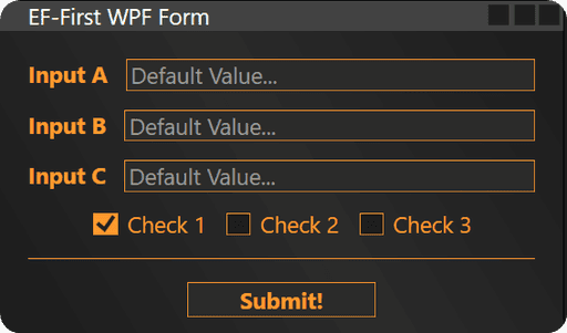
<Window.Background>
    <LinearGradientBrush StartPoint="0,1" EndPoint="1,0">
        <GradientStop Color= "#1c1c1c" Offset="0" />
        <GradientStop Color= "#2b2b2b" Offset="0.5" />
        <GradientStop Color= "#1c1c1c" Offset="1" />
Here is how my form looks so far
If you want to make it look a more interesting, you can try other Gradients.
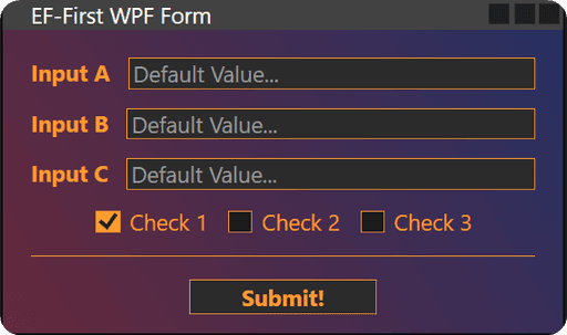
Here is an example of a gradient I used in my EF-Tools extension.
Feel free to steal that one.
<Window.Background>
    <LinearGradientBrush StartPoint="0,1" EndPoint="1,0">
        <GradientStop Color= "#55FC467B" Offset="0" />
        <GradientStop Color= "#553F5EFB" Offset="1" />
This one looks nicer, but make sure to adjust other colors to match it.
Orange is not the best choice for that one.
Test form in Revit
Also if you want to test this form inside of Revit, you can use the same WPF Base Class that we made in all other lessons. We don't have any Events, so it's super simple.
Copy XAML code to pushbutton
Create WPF Class
from Autodesk.Revit.DB import *
from pyrevit import forms
import wpf, os, clr
clr.AddReference("System")
from System.Collections.Generic import List
from System.Windows import Window, ResourceDictionary
from System.Windows.Controls import CheckBox, Button, TextBox, ListBoxItem
PATH_SCRIPT = os.path.dirname(__file__)
doc = __revit__.ActiveUIDocument.Document
uidoc = __revit__.ActiveUIDocument
app = __revit__.Application
class MyForm(Window):
def __init__(self):
path_xaml_file = os.path.join(PATH_SCRIPT, 'StyleForm.xaml')
wpf.LoadComponent(self, path_xaml_file)
self.ShowDialog()
UI = MyForm()
Form Flaws
Alright, our form looks fine, until we actually start to interact with it. Then we notice some flaws.
Tick inside CheckBox is not visible
CheckBox Hover effect
Button Hover Effect
We will address the Checked state of the checkbox now, but for the hover effect we will need to dive into another concept in the next lesson. Let's fix the checked state first.
Style Triggers
We've set the Background and Foreground of our <CheckBox>, but now we want to change it when it's Checked. To do that ,we need to use <Style.Triggers> in XAML code. And it's not complicated, it's like creating an if-statement.
Here is the code:
Alright, our form looks fine, until we actually start to interact with it. Then we notice some flaws.
You will notice that when we ho
Now we’ll add some interactivity to the CheckBox by changing its background color when it’s checked. This is where triggers come in handy.
<Style TargetType="CheckBox">
    <Setter Property="Foreground" Value="{StaticResource accent}"/>
    <Setter Property="Background" Value="{StaticResource bg1}"/>
    <Setter Property="BorderBrush" Value="{StaticResource accent}"/>
    <Setter Property="BorderThickness" Value="0.5"/>

    <Style.Triggers>
        <Trigger Property="IsChecked" Value="True">
            <Setter Property="Background" Value="{StaticResource accent}"/>
        </Trigger>
    </Style.Triggers>
</Style
The Trigger here changes the CheckBox background to the accent color when it is selected, creating a clear visual indication of the checked state.
🙋♂️ See you in the next lesson.
- EF
🙋♂️ See you in the next lesson.
- EF
Discuss the lesson:
P.S. Sometimes this chat might experience connection issues.
Please be patient or join via Discord app so you can get the most out of this community and get access to even more chats.
Discuss the lesson:
P.S. Sometimes this chat might experience connection issues.
Please be patient or join via Discord app so you can get the most out of this community and get access to even more chats.


