Summary
Introduction to XAML for WPF UI Forms
The last big topic you need to get familiar with is XAML. It's a file format to create UI design for your WPF Forms.
The best way to get familiar - is to start using it.
In this lesson, we'll open Visual Studio and create a very simple UI form.
And I will break down all UI components as we write them.
But let's start with a simple question - What is XAML?
What Exactly Is XAML?
XAML stands for eXtensible Application Markup Language. It's a declarative language that we use to define and initialize objects in WPF. Think of it as a blueprint for your user interface.
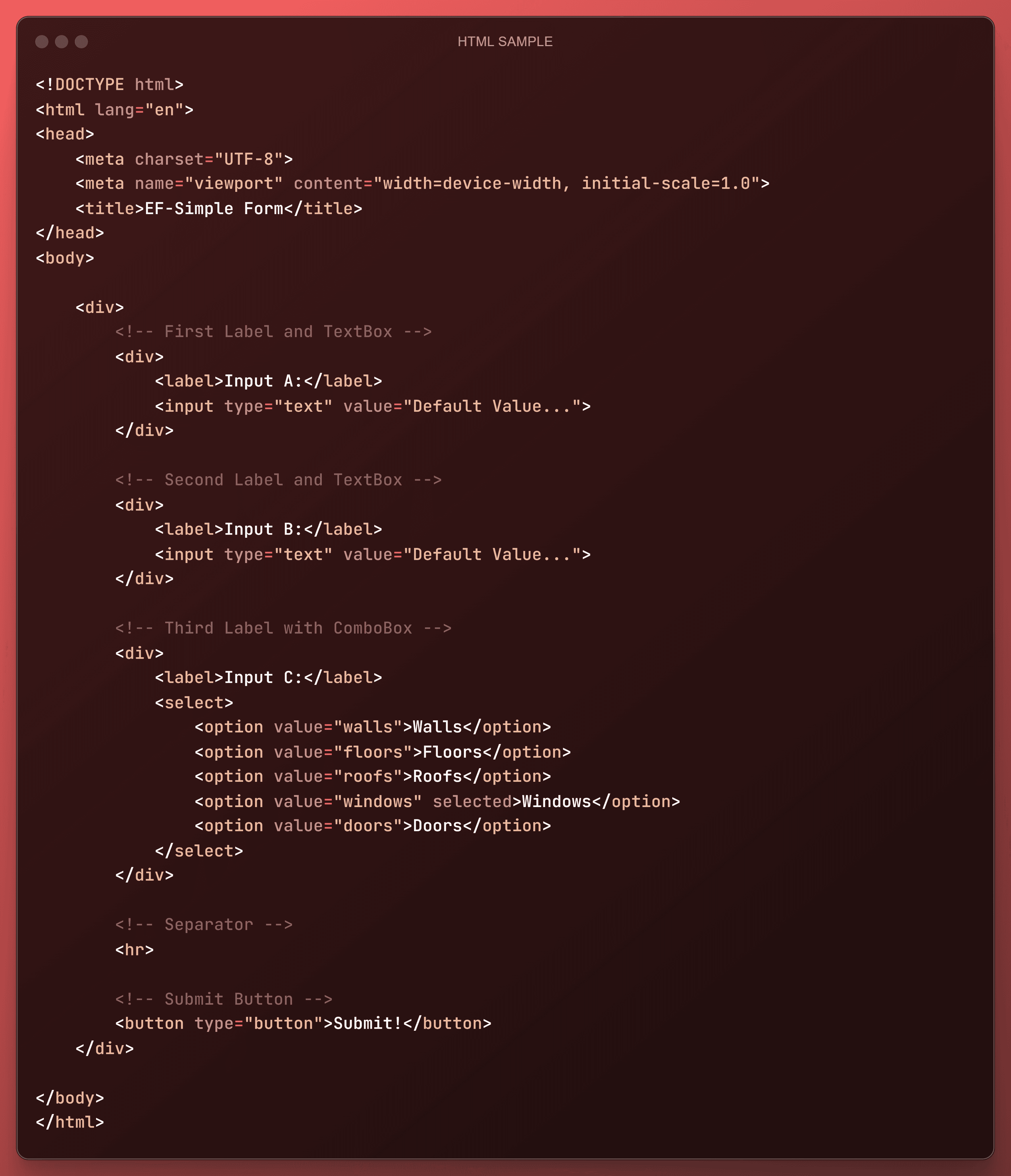
Just like HTML is used to structure content on the web, XAML is used to structure your UI components in a WPF form.
Also, keep in mind that
WPF is a framework for building rich desktop applications
XAML is an XML-based language for defining UI elements in WPF.
XAML has a very similar syntax to HTML to define components with angle brackets and to fill in attributes inside the opening tag.
But unlike HTML, XAML is strongly tied to the .NET framework and therefore is used with .NET languages like C#, VB.NET, and IronPython. Obviously, it has different names for components and attributes than HTML, but you'll see this in a moment.
Why Do We Use XAML in WPF?
The beauty of XAML lies in the ability to separate the UI design of your forms from the code logic.
This separation makes it much easier to manage and maintain your application, especially at scale.
Designers can work on the look and feel of the XAML forms, while developers can focus on the backend code and think about all the logic and everything they need for the form.
But in your case, you're going to be both the designer and developer.
Behind-Code in WPF
Also, keep in mind that you can create your WPF forms by only using Python code without any XAML, and it's usually referred to as using Behind-Code when we create WPF forms with python code.
But it's going to be a mess as you would need to declare a lot of classes and fill in all the properties one by one. But sometimes it might be necessary, and we will dive into that during the course.
But in general, we'll use XAML for our main front-end and python to populate data and interaction for the form in the back-end.
👈Here is an example of creating a form with only behind-code.
As I've warned it you can become a mess because you need to define every single property on a new line.
Just briefly look at what it would look like, but no need to copy anything.
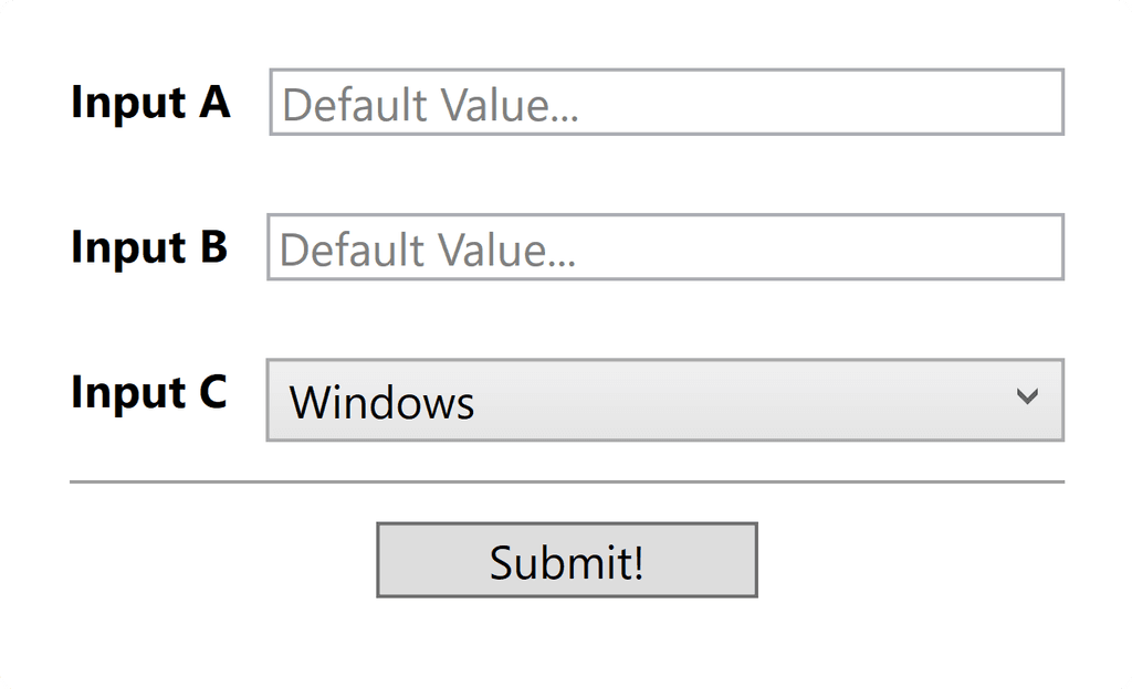
This code is used to create a form like this.
As I mentioned, the best way to explain what XAML is to create a UI form, and I'll try to explain everything you might need while we do that.
What we will create?
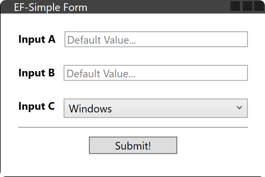
So let's open Visual Studio and write XAML code for a simple form like this:
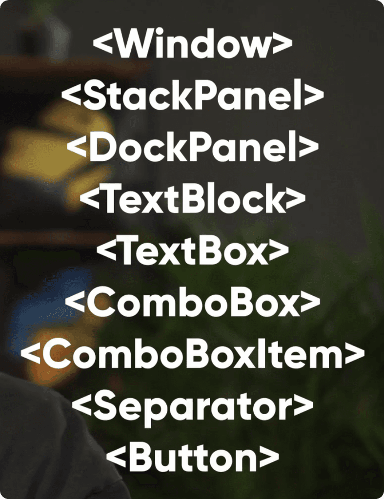
On the right you can see all the controls (UI elements) that we will need to create for our WPF code.
And don't worry and will break them down one by one, so you don't feel overwhelemed.
Also keep in mind that we will only focus on the Front-End of the form as we will dive into connecting it to back-end (python) in the next module.
So let's begin!
Create Simple WPF Form with XAML.
Let's open Visual Studio with WPF project (as I showed in previous lessons) and start creating our XAML form.
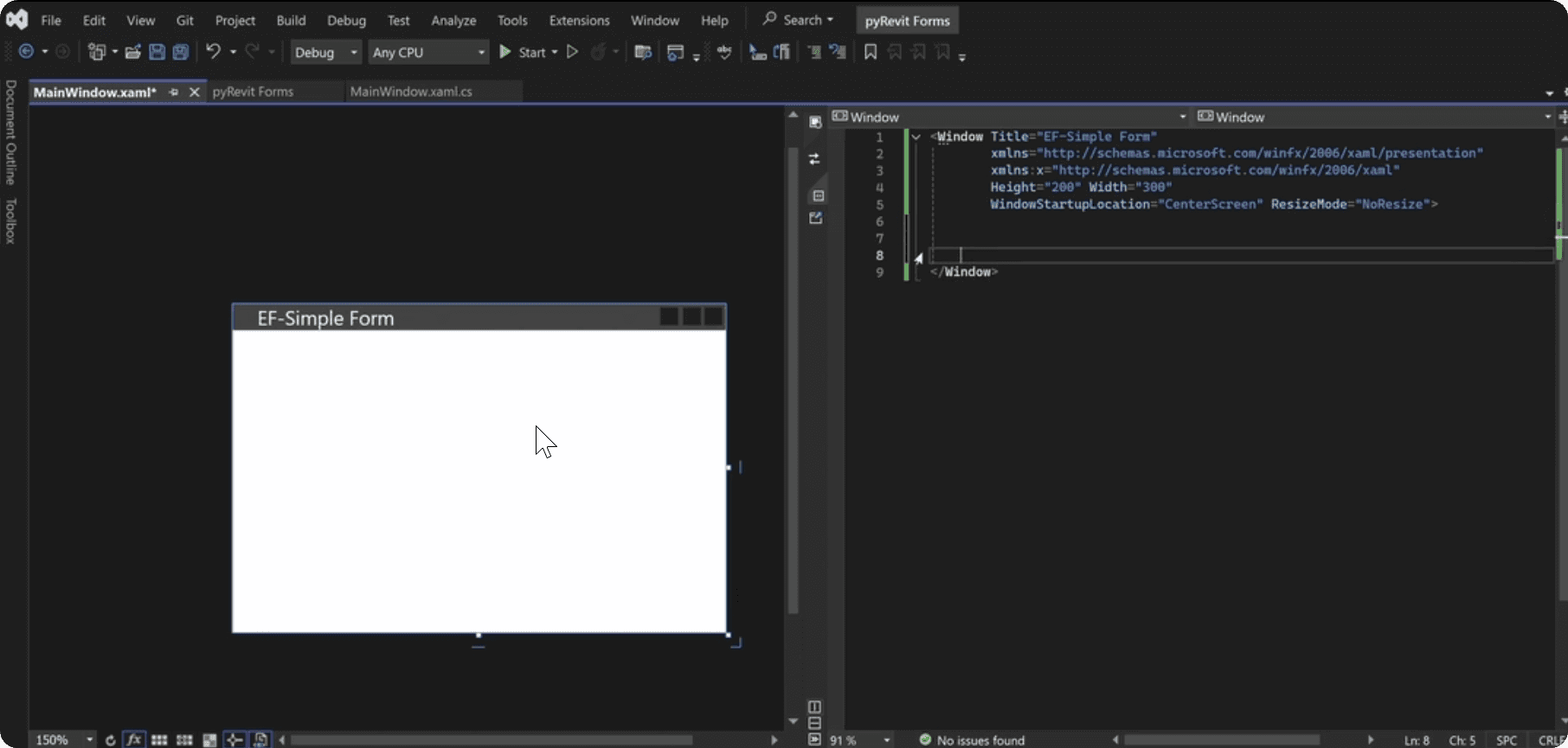
This is the starting point. You have a preview of your form on the left, and some basic template on the right.
Here is my starting code with Window control:
First of all, we have this <Window> element, that represents your form. This is the root of your WPF UI form.
In WPF every UI element is called Control and it's defined with arrow brackets < >, similar to HTML.
It can also have self-closing tag, or it has Start and End tags, and all content will be placed in between which goes inside this Control.
Here is example of a <Button>:
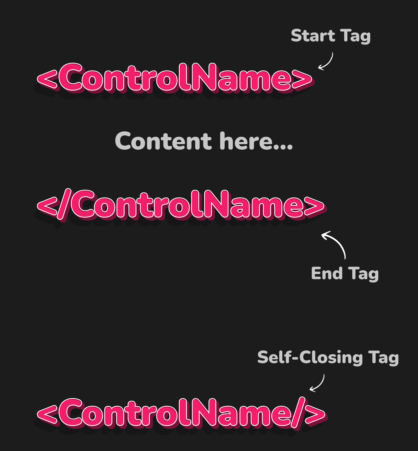
Inside the Start tag we can also define attributes for this control, like Windows has:
Title
Height
Width
and so on…
We will talk more about Syntax while we code.
WPF - StackPanel
Next let's create a <Stack Panel> which will be the main container for our WPF controls.
StackPanels will literally stack your elements vertically but can also be configured to stack horizontally.
We can also use <Grid> if we need more control for columns and rows of different sizes, but I always recommend beginners to begin with <StackPanel>.
⌨️ You will also notice that Visual Studio will help you with autocomplete, which is really useful..
Here is how it looks:
Shortcuts in Visual Studio
Also, before we go too far, let me tell you a few useful shortcuts in Visual Studio.
CTRL+K+C - Comment Selected Code
CTRL+K+U - Uncomment Selected Code
CTRL+K+D - Format Document (Fix Identation)
Code Skeleton
Next let's write the skeleton of our WPF code so it's easier to follow along.
Skeleton can be written with just simple comments to create a structure for your form. You can even write it out on a paper so you have logical flow of your code in front of you.
I will add the following comments:
WPF - TextBlock and TextBox
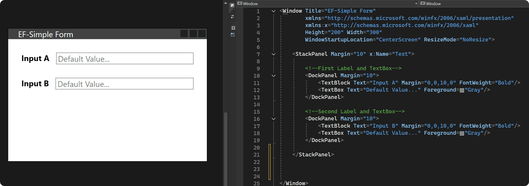
Alright, let's begin with the first step - adding <TextBlock> and <TextBox>
Since we want to have 2 elements on the same line we need to use another container. We could even use another <StackPanel>, but I prefer using <DockPanel> when I create elements on the same line.
Create a <DockPanel> with Start and End Tags and then we can add elements inside of it by defining <TextBlock/> and <TextBox/> and notice that these elements will have a Self-Closing Tag (/>)
Next we need to change a few properties of these elements. We can write the name of the property we want to change and assign a value inside the Start tag. Similar to HTML…
Margin - Spacing around the element
4 values - Left, Top, Right, Bottom
1 value - all sides
Text - Obviously Text inside the text elements
FontWeight - Font Weight (Regular, Bold, Medium…)
Foreground - Color of the text
Here is the code with attributes.
Now duplicate the same DockPanel for the second input and it already starts to look pretty good.
Adding a ComboBox
Next let's add the 3rd input as a <ComboBox>, which is like a pulldown menu with options to choose from.
We will use the same structure of the <DockPanel> and only replace <TextBox>
Also notice that to provide options to choose from, we need to populate Children elements of the <ComboBox>, which are called <ComboBoxItem>.
This is fine for assigning hard-coded values which can't be changed. But for majority of your forms you would want to populate data dynamically based on the elements in your Revit project.
So, instead you would have to get your <ComboBox> and populate items in behind-code.
💡You will learn how to do that in the second module, but here is a simple abstract example so you get an idea of how it works.
WPF - Separator
Next let's add a separator, which is just a horizontal line to separate your WPF controls visually.
WPF - Submit Button
And lastly, we need a submit <Button> so user can submit their inputs.
We will also need to define Content and Width properties so it looks nicer.
Here is the code:
Final XAML Code
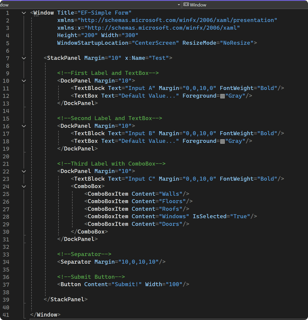
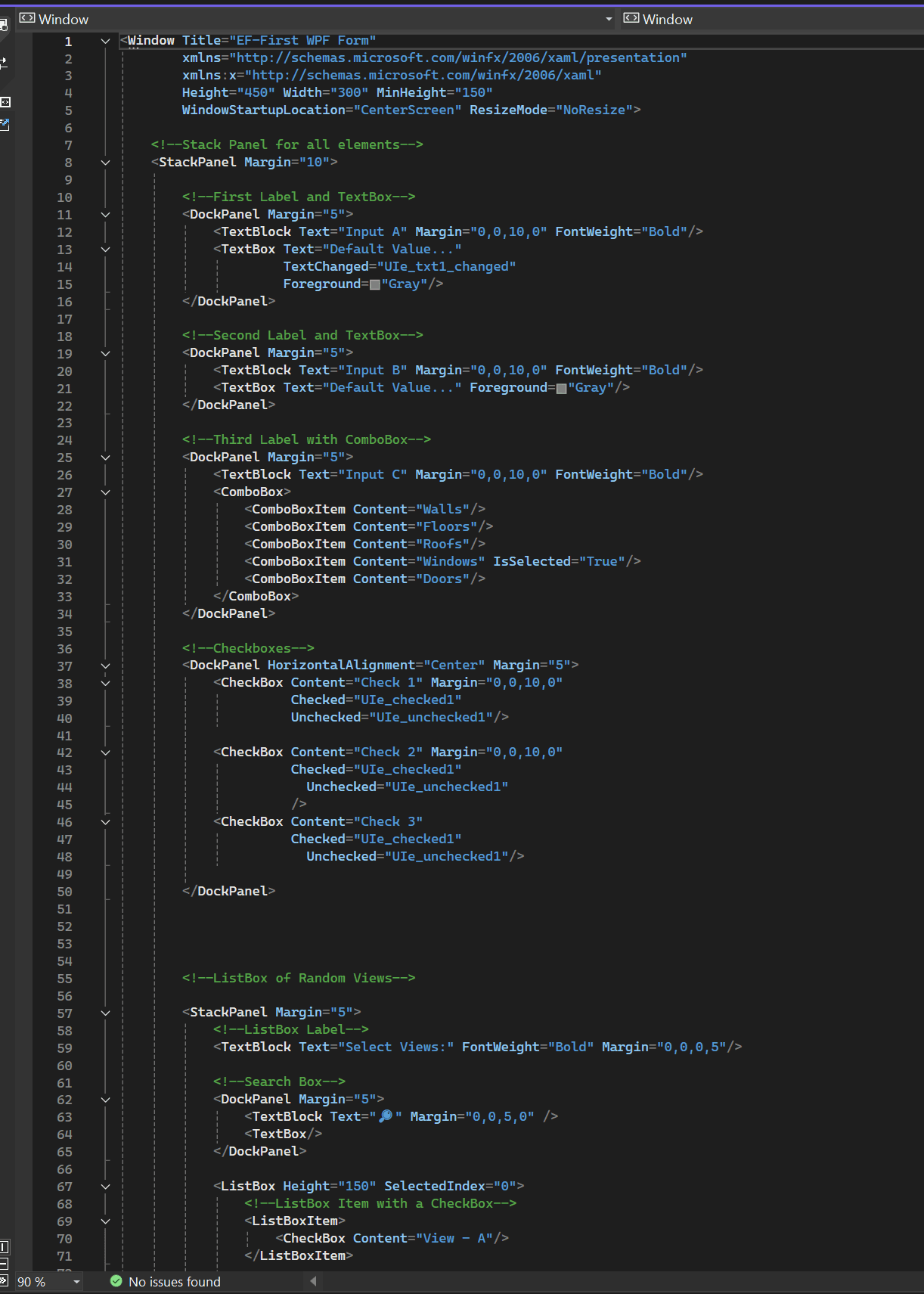
Now let's put it all together to avoid any errors:
And that's how it looks:
Usually when you see XAML code for the first time it might look intimidating. But once you went through all these steps yourself and wrote a simple form it actually starts to make a lot of sense, isn't it?
Now let's go through the code and talk about other aspects of XAML you should be aware of.
The UI Tree
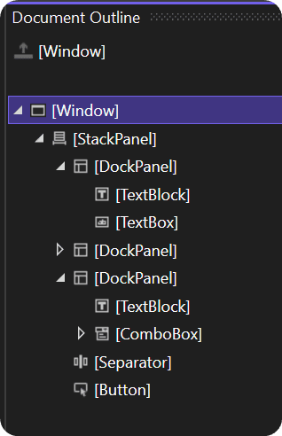
XAML UI is structured as a hierarchical tree of elements, often referred to as the visual or UI tree.
Each element in this tree is a WPF Control and they have relations to their parent containers and children elements inside of them.
The tree begins on the top with <Window> and then it branches out to include other WPF Controls.
WPF Controls in XAML
Let's review WPF Controls.
These components are the building blocks of your UI form, and each one of them corresponds to a specific class in the WPF framework, which has its own properties, events, and so on.
These controls can be defined with Start/End Tags or just with a Self-Closing Tag.
We actually covered quite a lot of controls in this tutorial:
Window: Represents the main window of your application.
StackPanel: A container that stacks all the child elements inside either vertically or horizontally.
DockPanel: Arranges its child elements in a dock where you can space elements at the edges.
TextBlock: Displays text.
TextBox: Allows the user to input text.
ComboBox: A drop-down list from which the user can select an item.
Separator: A line used to separate elements visually.
Button: A clickable button
WPF Control - Properties and Attributes
You'll notice that properties and attributes are always in the starting tag of the component. For example:
This is how you can modify how your control looks or functions in your WPF forms. You will learn more about these properties and where to find them when we start building more forms.
Namespaces
In the <Window> tag, you might notice the xmlns attributes, and they can be really confusing:
These are namespaces, similar to imports in your Python scripts. They bring in the necessary classes and allow you to use correct WPF classes and attributes like `x:Name.
Just think of them as imports and don't mess with them.
WPF Control - Styling
Also, Let me tell you about styling in XAML code.
I think it's a bit too early, but I will just briefly show you examples so you get an idea. And don't worry if it's too overwhelming for now, we will cover styling in detail in module 04.
So here is how I would apply style for <Textbox> to modify CornerRadius property. It's not so straight forward as need to go into the <Border> of <TextBox>, therefore it might look a bit confusing.
Global Styling
You can already imagine what your code would look like if you would add styling to every element. That would be a mess!
But there is a way to define global styles for your components. Like style templates for different elements, and we can define these styles inside of <Windows.Resources>
Again, it's just an example, you don't need to understand it completely for now.
Conclusion
This is the basic introduction to XAML.
We've created the front-end of the form using XAML syntax, but remember that we still need to connect this UI form with our IronPython code, so it can be shown and interacted with by the user.
Usually, this is where everybody gets stuck because WPF forms is not very well documented for Python, especially for pyRevit.
But I will show you everything step by step and help you get started creating awesome-looking WPF forms for pyRevit.
Homework
Now it's time to practice for you!
First of all, try to mimic what I did here, but try to experiment a little bit more. Change the order of how the elements look. Try adding more elements or maybe even other controls.
Look at their properties, change something else, change the sizes, and see what else is available. Just experiment with XAML and see how far you can go.
Honestly, you'll learn so much more about XAML by just randomly exploring it and trying to make things yourself.
Also, you're going to get some errors while you experiment, and that's okay! Don't worry; it's okay that you're going to get errors.
This is exactly what we're going to talk about in the next lesson, where we will talk about debuggin your XAML scripts so you know what to do when you encounter XAML errors.
